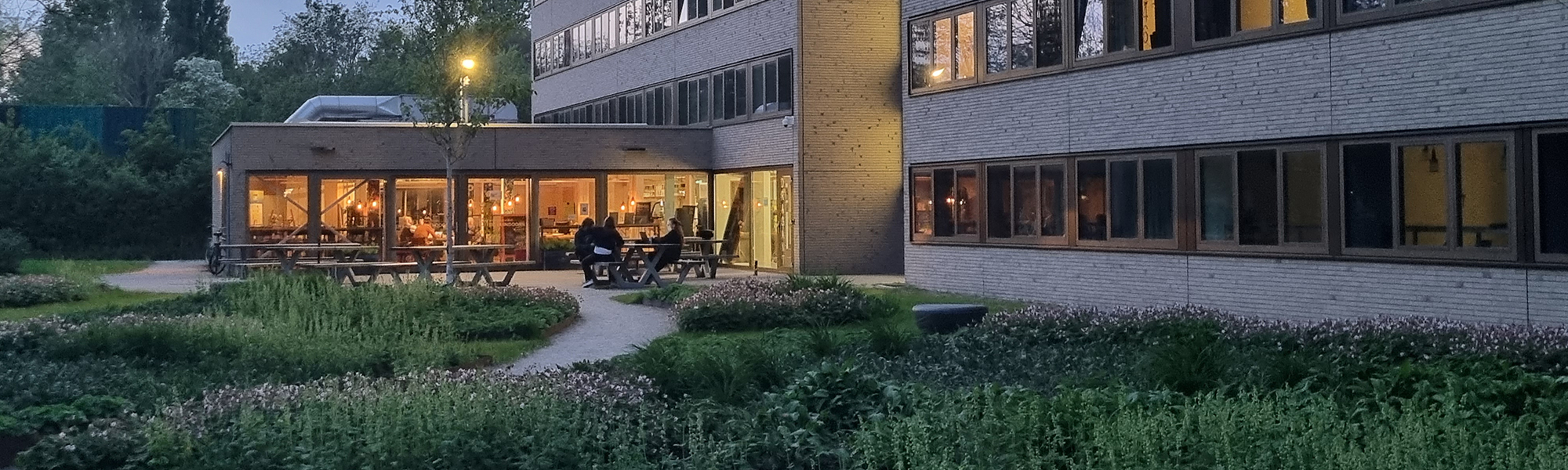
Restaurant De Duindoorn, part of the Wijkbedrijf Selwerd, wanted to improve its reputation and better align its product offering with the needs of the neighborhood.
Through time the printed and digital materials had lost their recognizability and the restaurant was poorly visible from the street. To give the restaurant a boost, all these problems where tackled in a series of projects.
A survey among neighborhood residents was held, a new corporate style and style manual where developed and new signs and flags where designed to guide people to the restaurant. All the printed materials got an update in the new style and a new website was created. Social media channels got updated and a series of activities was organized to draw the attention of the local population.
How can we help you
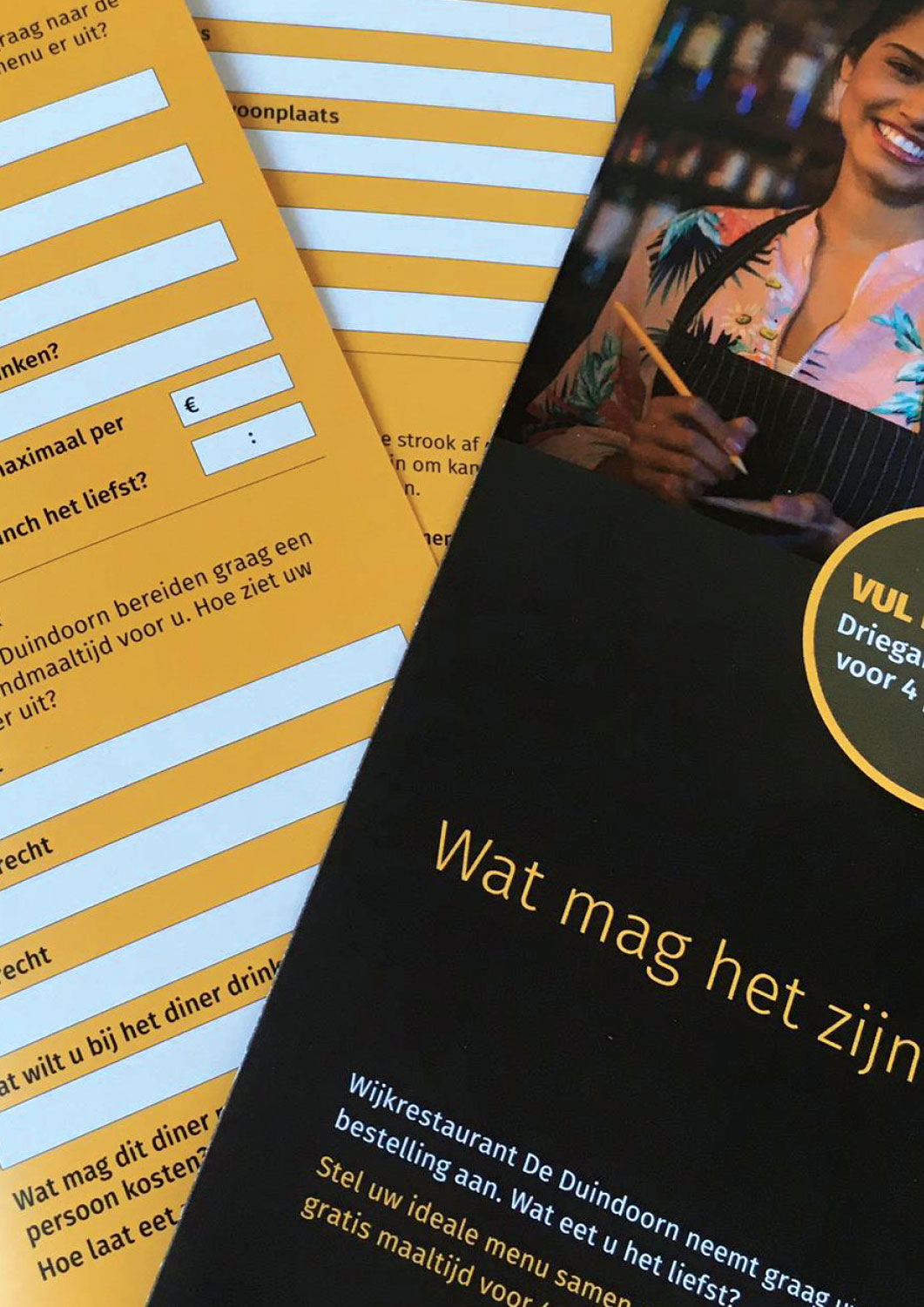
Firstly a questionnaire was prepared in which the restaurant introduced itself and inquired about the expectations of neighborhood residents. The questionnaire was delivered to all addresses in the neighborhood. Those who returned the completed survey had a chance to win a free three-course dinner. From the answers the management could define a new strategy regarding opening hours, menu style and pricing.
The survey also yielded insights into of the reputation and brand awareness of the restaurant.
Corporate style
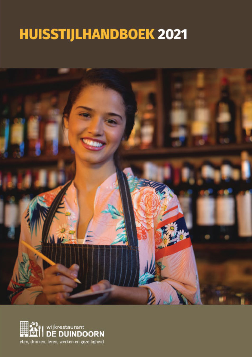
De Duindoorn did not have a defined house style. A new corporate identity was created based on the existing logo. Warm colors were chosen to reflect the friendly atmosphere of the restaurant and match the interior. Simple but unambiguous typography increases the recognizability of the restaurant. In order to firmly embed the corporate identity in the organization, a handbook was written, in which color usage, typography, paper types, sizes and other relevant matters are defined.

Corporate identity – manual
Signage
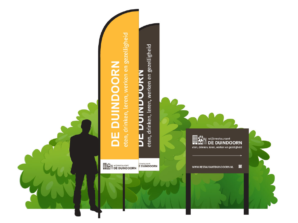
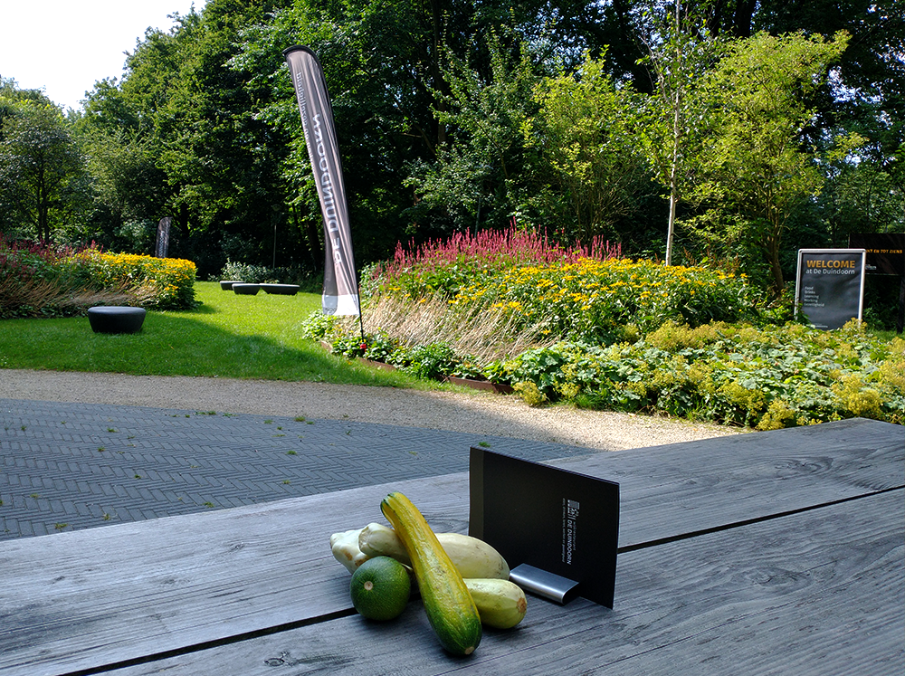
De Duindoorn is somewhat hidden, in a quiet corner of the neighborhood. To better direct visitors to the restaurant, billboards and flags were placed at strategic locations. The effect of these directional signs was immediately noticeable in the restaurant’s turnover. The restaurant is located near the famous Pieterpad hiking trail. A mention on the Pieterpad website and clear signposts from the route now regularly bring hikers to the restaurant.

Entrance & directions signs in the corporate style
Print materials
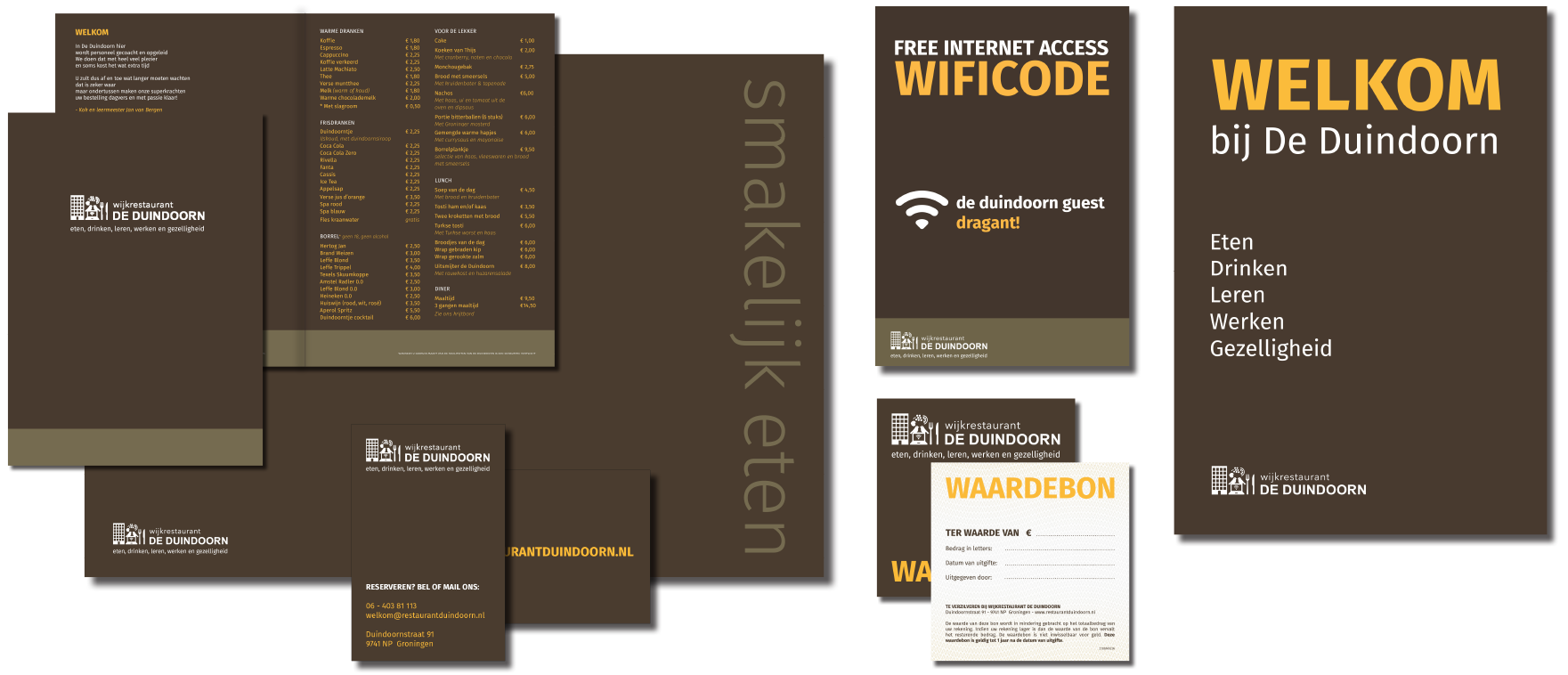
Inside the restaurant, all printed items, such as menus, placemats, coupons, business cards and information boards were done in the new corporate style. For the menu a thick laminated paper was chosen to increase the lifespan of the menu. A well structured Adobe InDesign document assures easy updates of prices and items.

Complete overview of the print materials for De Duindoorn. Menu, placemat, business card, wifi poster, gift card and street poster A1.
Website, social media and posters and flyers
The website also got a remake in the new style and a series of social media posts and posters and flyers where created to promote activities of the restaurant.